The may issue of i-D magazine has a nice and in depth interview with Tetsu Nishiyama, the co founder of
Neighborhood and creator of
W-taps if you get the time check it out, its worth the read.
Although im not sure about the new layouts the mag is going with, bring back the normal one please.
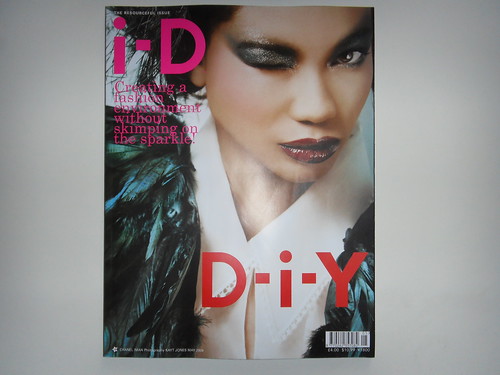
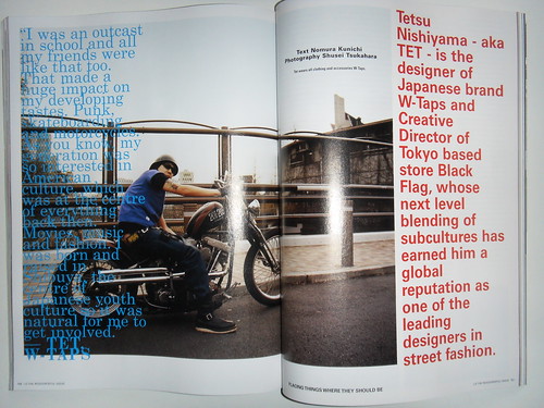
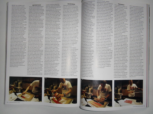
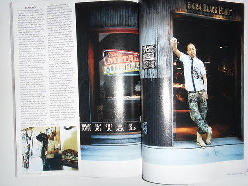
Loving bntl like a fat kid loves cake.


I'm feeling the layout actually. The way Dazed is done I think is shocking
ReplyDeleteHmmm agree re: the new i-D layout. Also not so sure about Neighborhood - went to the store in Tokyo and the overuse of Nazi paraphernalia kinda freaked me out. I get the militia thing but swastikas in abundance just aint right!
ReplyDeletei thought the dazed layout this issue was bog standard.
ReplyDeletethe whole news paper column like arrangement of the text in this particular i-d was just a little to much for my liking.
the mad contrasting fonts (not to say this hasn't been done before) but its just a little more apparent in this issue imo.
but i guess where gonna start seeing a lot of magazines looking a lot different now, due to this economic down turn . . .
uncle tom
ReplyDeleteagreed^^^
ReplyDeleteIf I had to rate posters on bntl I would rate you as a never were.
Just like your mother when you were in her womb, someone should have aborted your account
you worked hard on that line innit ? ? ?
ReplyDeleteuncle tom
ReplyDeletemister lego thought you wanted to work at dazed, hahahahahahahaha joker
ReplyDeletecan't lie did wanna work at dazed at one point, opportunity did arise but i couldn't take it . . .
ReplyDeleteby chance ended up working in the dazed building, under another company saw how things were run in both "camps" and realized magazine graphic design isn't for me.
tet is a legend.
ReplyDeletebut new wtaps sucks!
picture 3;
ReplyDeletethe layout is simple and effective not sure about the use of the blue and red text overlapping the image.
i think designers have forgotten the reasons for using layout as a way of engaging the target audience and tend to try to make things look different and good.
Aitor interview in there is a BIG look too
ReplyDelete