The i seems to have its own little concise new age personality which I think works very well for London's fast pace living (not excluding the rest of the uk).
I especially appreciate the manor in which it seems to have a lot of in put from creatives. It has a make up which definitely looks like it could work very well on various other platforms to, so look out for much more from the paper in the near future.
One of the main reasons I chose it as "item of last week" was based on the fact I've never had the privileged of being present when any of the staple print British daily quality news papers where released back in the day.
I've only been fortunate to experience the free junk such as the London Light and whatever the other one was called which got bought by the Evening (chip bag) Standard, so hopefully this marks a good point in my generations history.
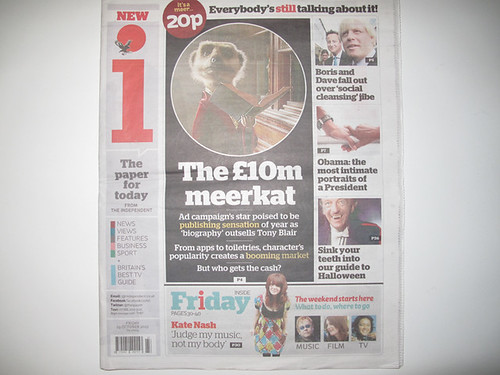
Brought to you by the award-winning team at the Independent, it’s not only a new paper, but a new kind of paper. Colourful and accessible, concise and intelligent, it’s your essential daily briefing. Packed with news, views, entertainment, business and sport, it’s the perfect way to start your day. And at a much more affordable price than a cappuccino.
We know that, as with any new product, it will take you a little time to feel comfortable with i. But we have tried to make everything as logical as possible, taking seriously our role as your guide through the information overload. The matrix on pages two and three is designed to give you an overview of today’s news stories and is replicated in business and sport, so that you can get everything you need to know at a glance. 
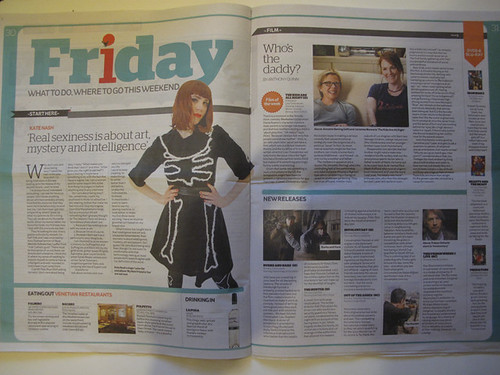


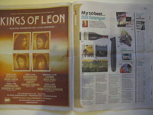

design of the papers content is pretty slick to, although im not sure if I'm a fan of the designs of print campaign though. The tilting text/image and red full stops just doesn't do it for me.
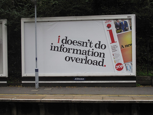
item of the last week vol 1
Loving bntl like a fat kid loves cake.







2 comments:
you evidently know freak all about visual design, otherwise you'd notice that the advert is very effective at leading the eye. You read the sentence, you notice the emphasis on the letter 'i', which is reinforced when you look at the logo...you scan the page quickly, you see the 20p. You don't need to like the way it looks. Through the use of tilted text and emphasis on the self(conscious) it's clearly aimed at you anyway.
ha !
i still dont like it even after your long winded explanation.
dont get your nickers in a twist it was my opinion.
Post a Comment