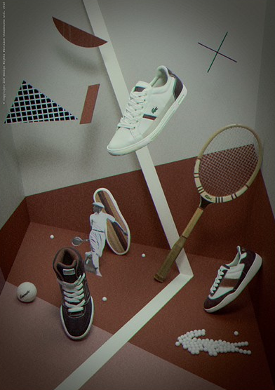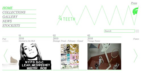
With the launch of this new range Lacoste also gave us a preview of the new site '24teeth.com' (a crocodile uses 24 teeth to tear apart its pray). The site is an opportunity for customers to see more of the design/inspiration process that goes into creating a shoe. Its standard procedure for a brand to have a blog these days but with this site you get more of a feel for the art direction of Lacoste. I'm really interested in the concept of allowing customers behind the scenes access that brands have been adopting over the last few years. We should all be interested in where our product came from and the process in which it was conceived.

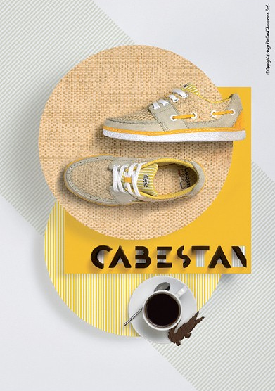
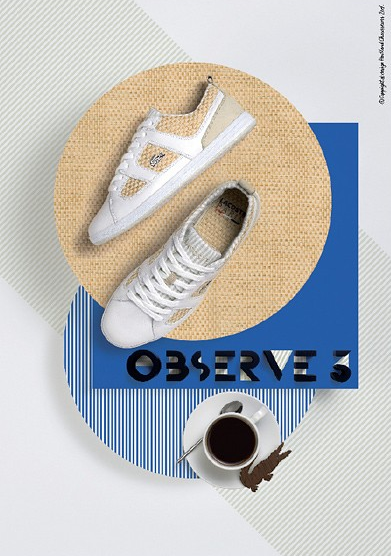
The art direction for Lacoste has always been of decent standard but on having a good look through the '24Teeth' website I feel that that standard has been improved. Some of my favourite campaign images...


Check out '24 Teeth' HERE.


No comments:
Post a Comment