
Taking it out of the envelope I was surprised to see the use of some sort of woven green cotton, for the cover (right there that's a couple of grand in itself if were gonna consider how many there gonna shift out).
The layout of the product and text was simple and effective which in some sort of way reflects A.P.C and the type of the brand and clothing they produce.
The layout is almost just like being in a store.
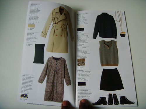
Another nice feature they have added to the lookbook is a little magnified part of the fabric. Used for each garment, this shows one how it has been woven and gives an insight into what the texture may feel like.

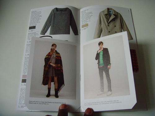
Each item of clothing has been fully opened up (information wise), everything from materials, to engraved buttons, to shapes of pockets and much more has been highlighted to the point where you might as well have it in your house there and then.
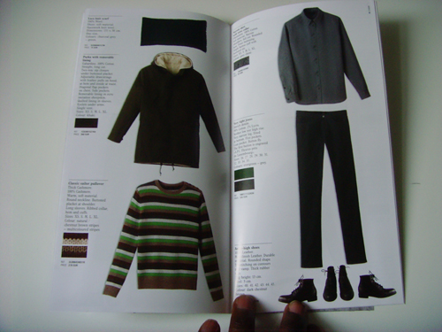
Days of up and coming clothing companies printing up look books/ catalogs have been almost none existent since youtube and blogs proved to be a LOT cheaper, but I must say i as a consumer i do appreciate and prefer having some sort of physical, interactive promotion pieces rather than some average poor photographic images I'm used to seeing on a daily basis. (not to say apc is up and coming by any means but it shows they've put in the effort or to say everyone uses poor photographic images)
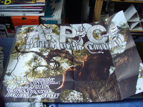
(The free poster was a good look as well)
Now I'm sure you realized my lack of talk on the clothing from the book, which was mainly due to fact there wasn't a great amount that jumped out at me, but there still is a few nice bits which makes it still worth the look.
to check out A.P.C's website just (click)
holdtight bambam bigaloooooooow ! ! !
Lego








No comments:
Post a Comment