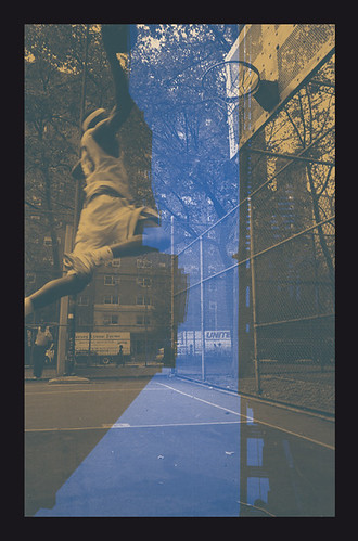
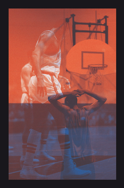
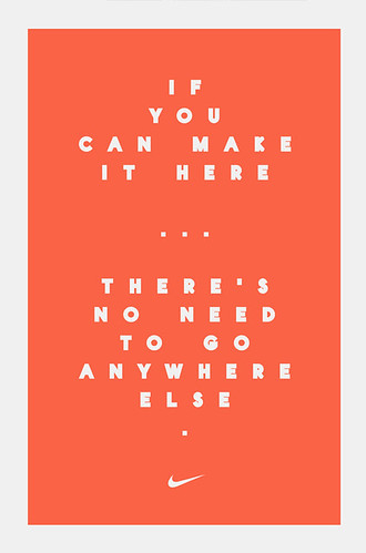
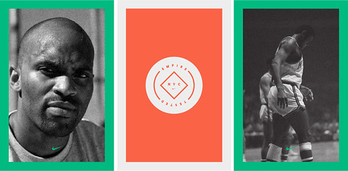
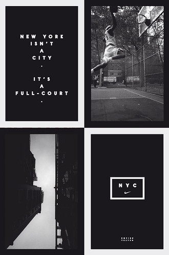
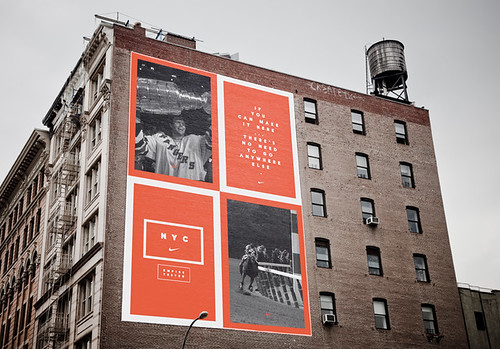
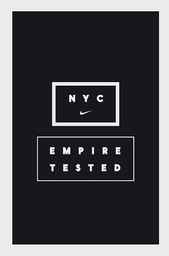
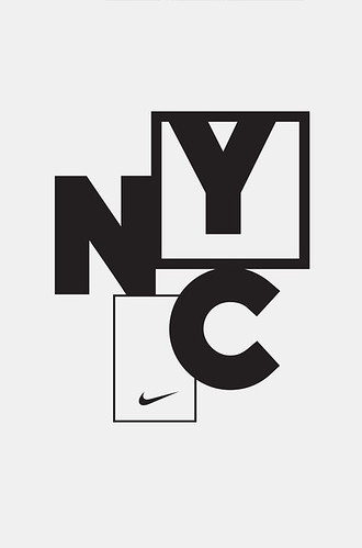
Without making the blog seem like some Nike fan boys site (As this seems to be the 3rd Nike post in quick succession), below are the images of some pretty tight visuals i came across cooked up by German design studio Hort for Nike.
There some months old but still a good look at regardless. I'm personally a big fan of the typeface.
There some months old but still a good look at regardless. I'm personally a big fan of the typeface.

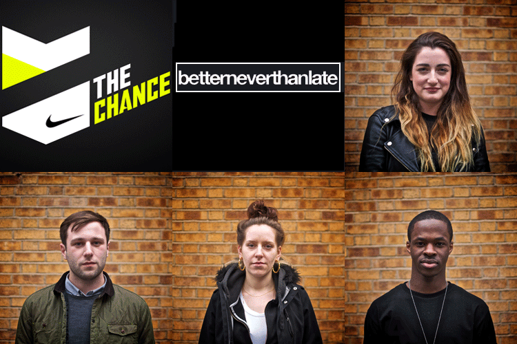
Loving bntl like a fat kid loves cake.





No comments:
Post a Comment